Empowering education through digital transformation
Scroll
Primary
Red
RGB 255 63 46
Accent
Light
RGB 255 216 208
Accent
Norsk Red
RGB 198 0 42
Accent
Norsk Blue
RGB 0 32 91
Folkeuniversitetet had the reputation, the reach and the impact. What it did not have was a visual expression that matched how modern adult learning works today. After the acquisition by Lingu, the brand needed to feel digital, open and contemporary, while keeping the familiar owl and colours that generations of Norwegians already trusted.
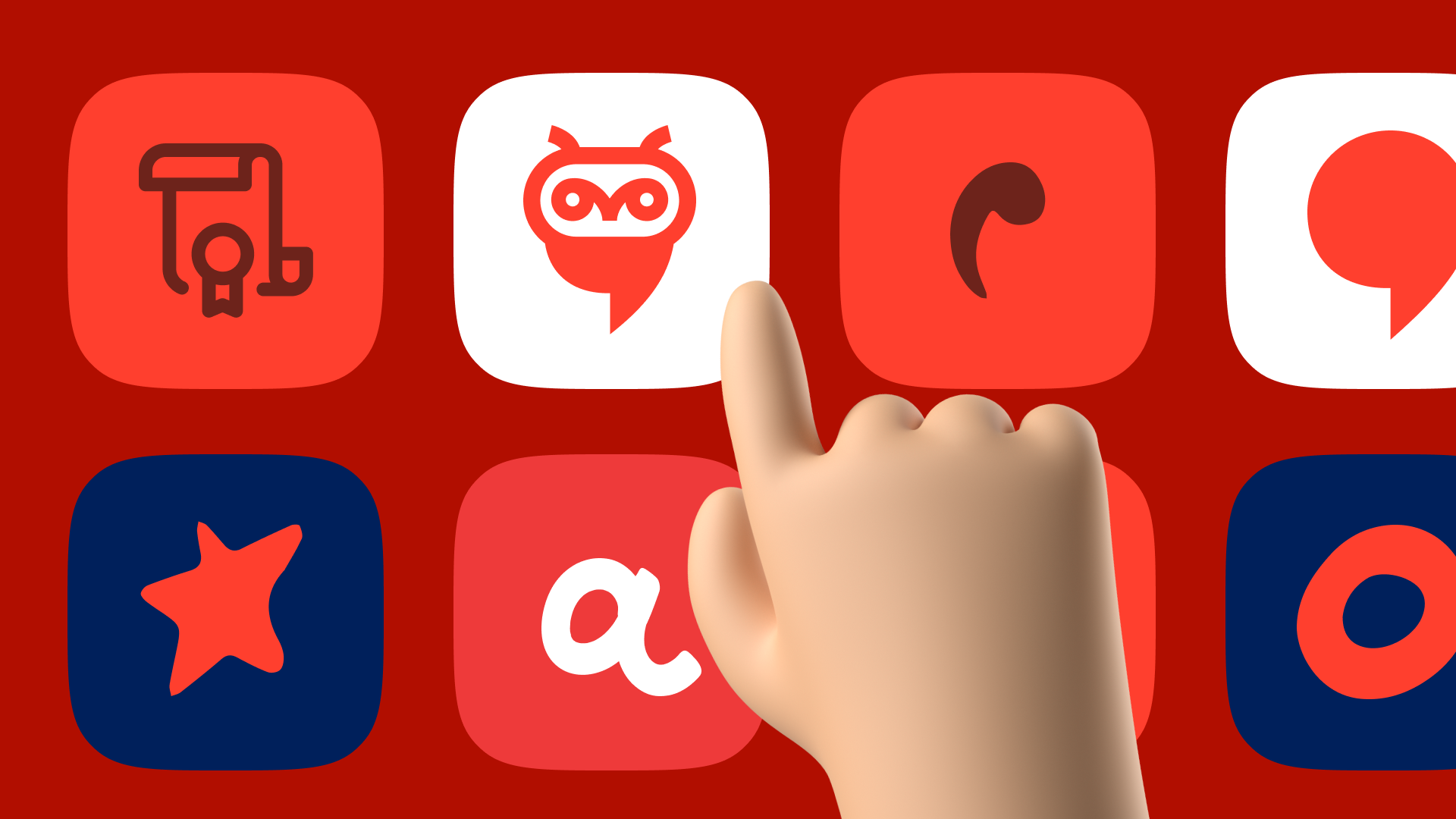
The brief came with one non-negotiable: keep the owl. It had been on buildings, diplomas and course brochures for decades. People recognised it instantly. Our job was to connect this legacy symbol with Lingu’s more modern, innovative attitude, and make the combined identity work for thousands of students, teachers and staff across every touchpoint.
01
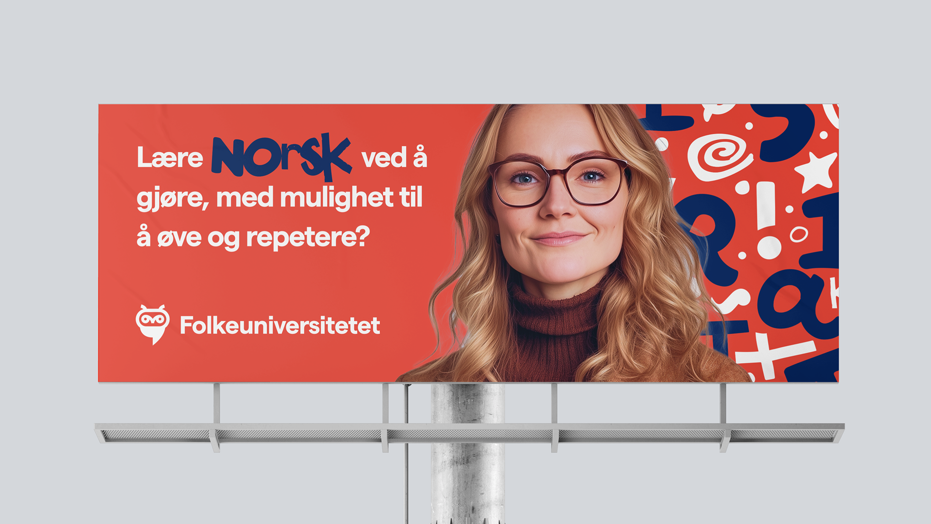
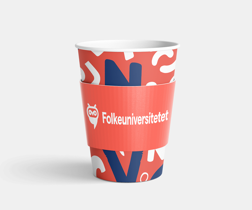
We kept the owl and core colour palette, and built a new visual language around them that feels friendly, open, smart and accessible rather than institutional.
02
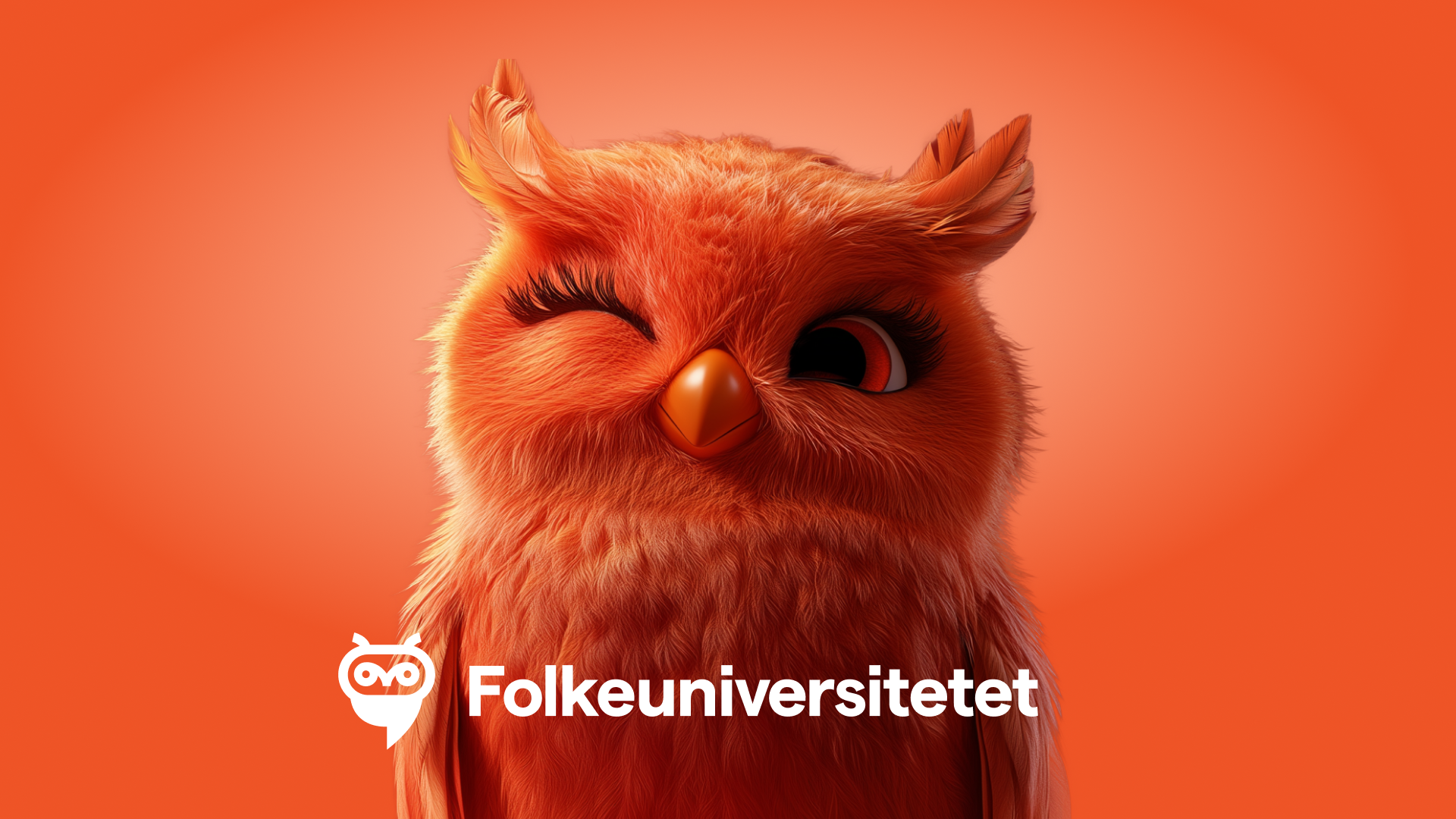
We merged the historic owl symbol with a speech-bubble form inspired by Lingu, creating a logo that speaks to both education and conversation, past and present.
03
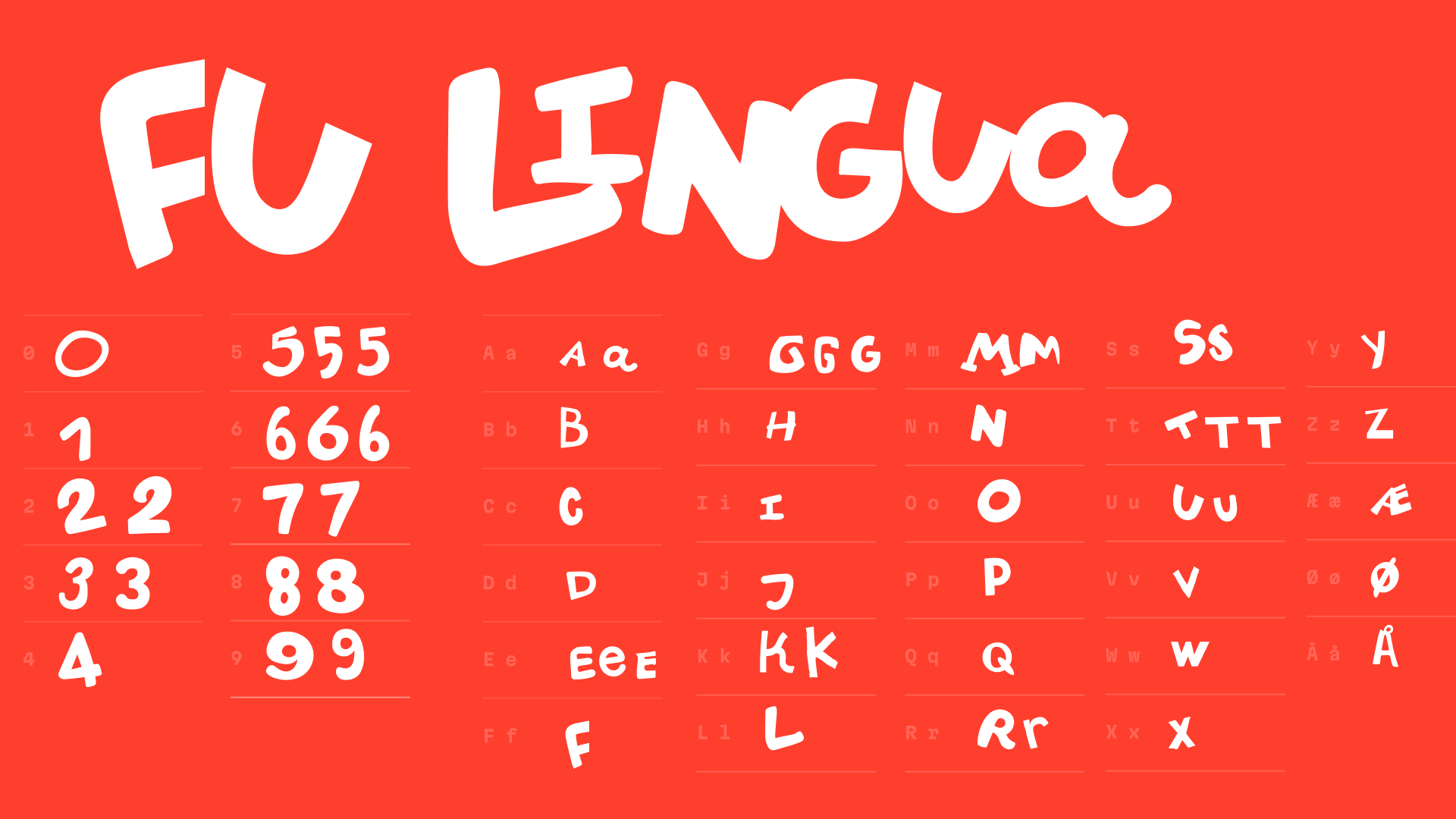
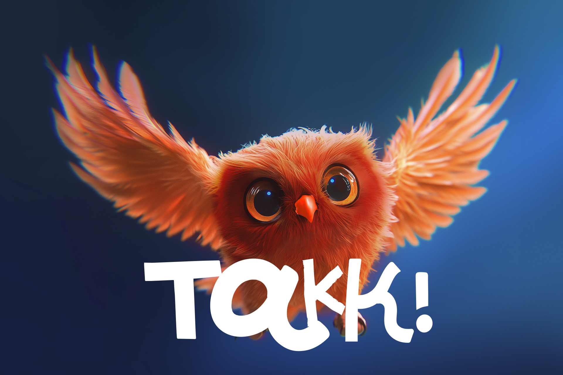
Using generative AI as a sketch engine, we explored many character shapes, then redrew and refined them into a custom “sketchy” display font for bold, memorable headlines.
04
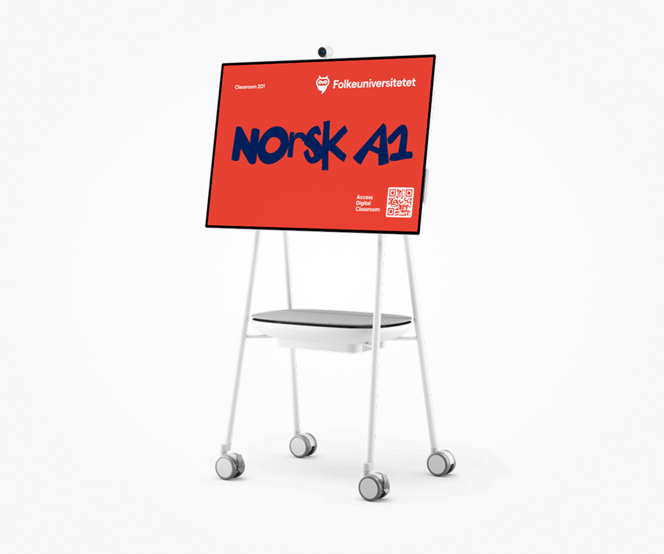
We applied the new identity to the website and platform, aligning layouts, components and interactions so the experience feels like one coherent, modern learning environment.
05
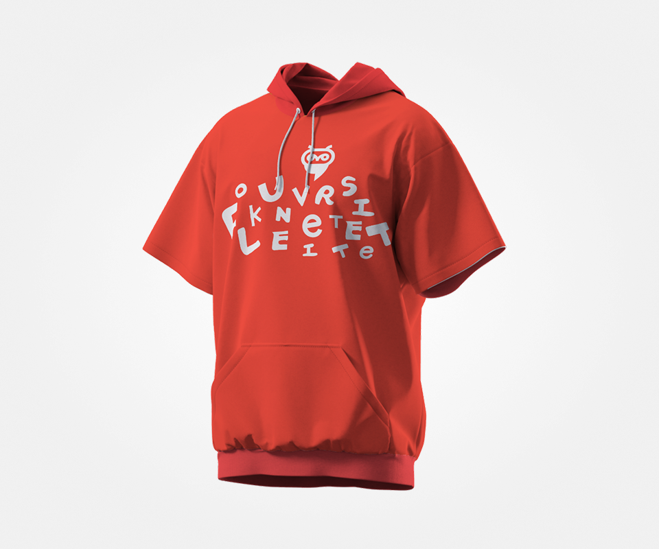
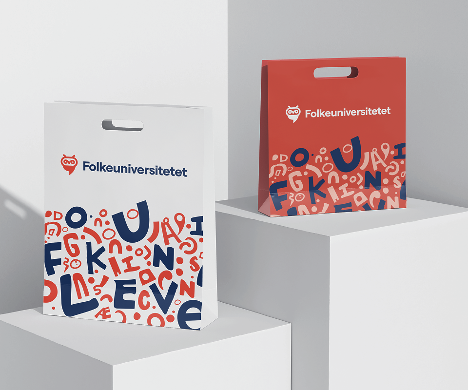
We created a logo system, full identity, visual guidelines, mini brand book and header styles, giving the marketing team a practical toolkit for campaigns and everyday communication.
06
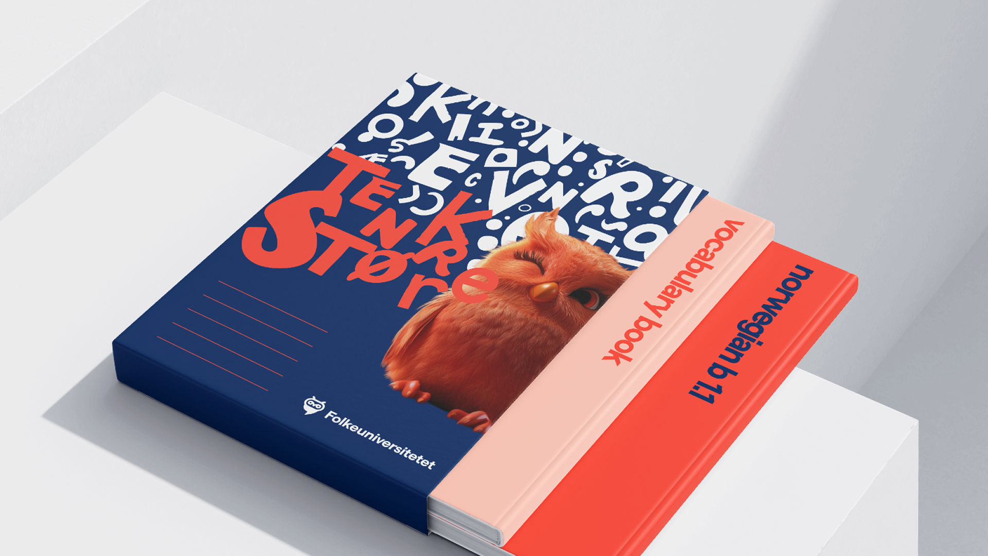
We introduced a character mascot, generated, refined and animated with AI, that now lives in digital ads and touchpoints, adding a human, playful note without diluting the core brand.
07
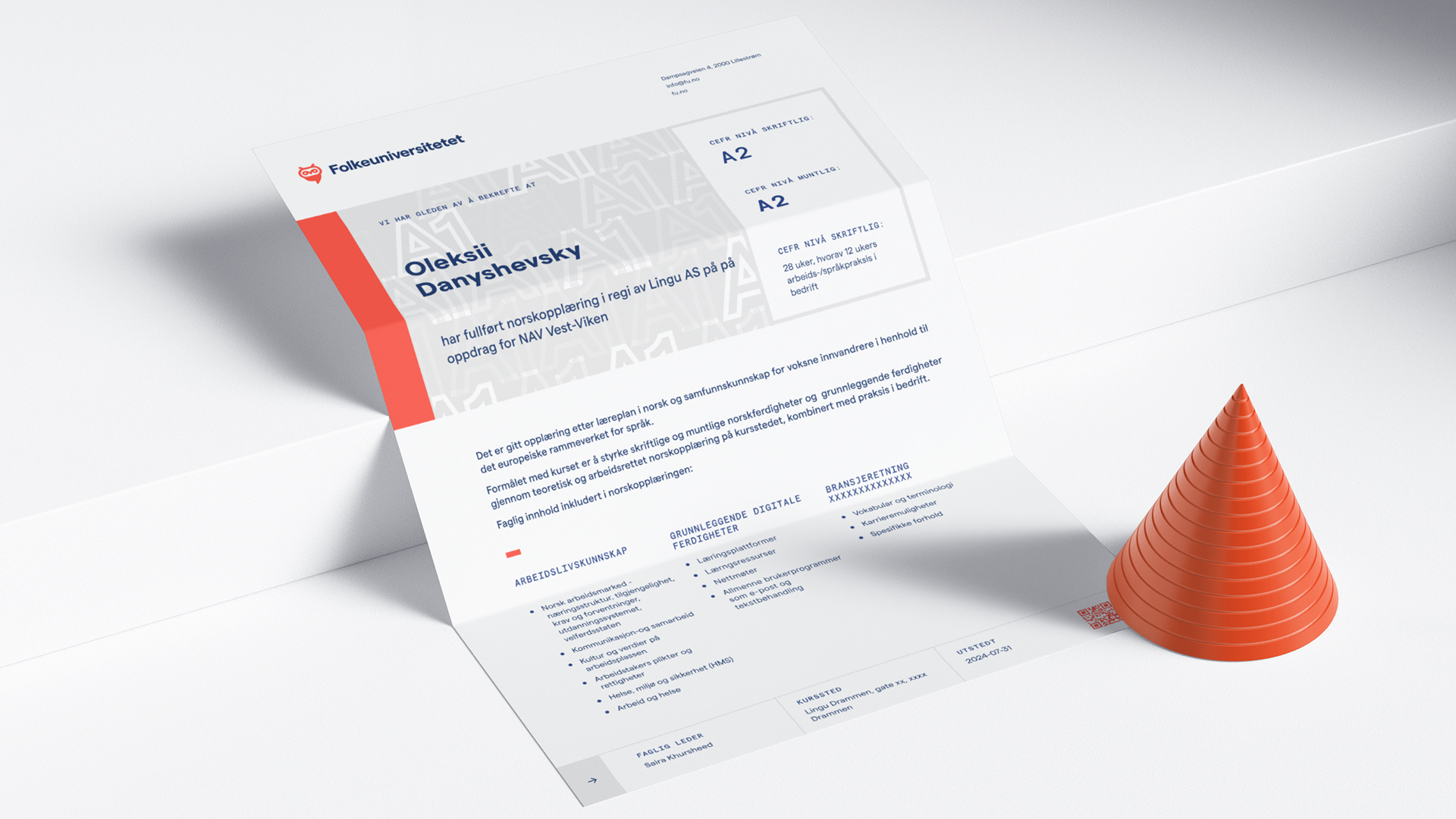
We continue to support applications such as diplomas and office branding, ensuring the new identity holds up not only on screens, but in classrooms, ceremonies and public spaces.
AI helped us where exploration is expensive: generating families of expressive letterforms and early mascot imagery that we later redrew by hand. It saved days of illustration work and opened visual options quickly. The actual decisions—art direction, typography, UX/UI and the final look of the identity—were made by the design team, not by the model.
Folkeuniversitetet now looks like what it already is: a serious institution that is not stuck in the past. The new identity is more open, contemporary and visually distinct, without losing the recognisable owl or the sense of trust built over 150 years. After launch, the in-house team used the system to drive strong campaigns and a refreshed web presence. Heritage stayed intact; everything else moved forward.
2024
Folkeuniversitetet
Education
Brand Strategy
Visual Identity
Web Design
Design System